
How to choose the perfect palette for your Brisbane home
Colour really does hold immense power in interior design, allowing us to shape the tone of a home and create a captivating atmosphere.
Whether we aim to establish a consistent mood throughout the entire space or influence each individual area, the interior palette serves as a key tool. When we design a home for a client here at Ivy + Piper we often start with looking at the architecture of a home and how this might influence the colour selections.
We then consider how the homeowner's unique style will be translated through the use of a colour palette and how they want to feel in the space. As interior designers in Brisbane, we understand the desires of our clients located in this beautiful area, who often seek vibrant, fresh, and harmonious homes. The overall colour palette really becomes the fundamental building block of their dream homes.
Understanding Natural Light in Brisbane:
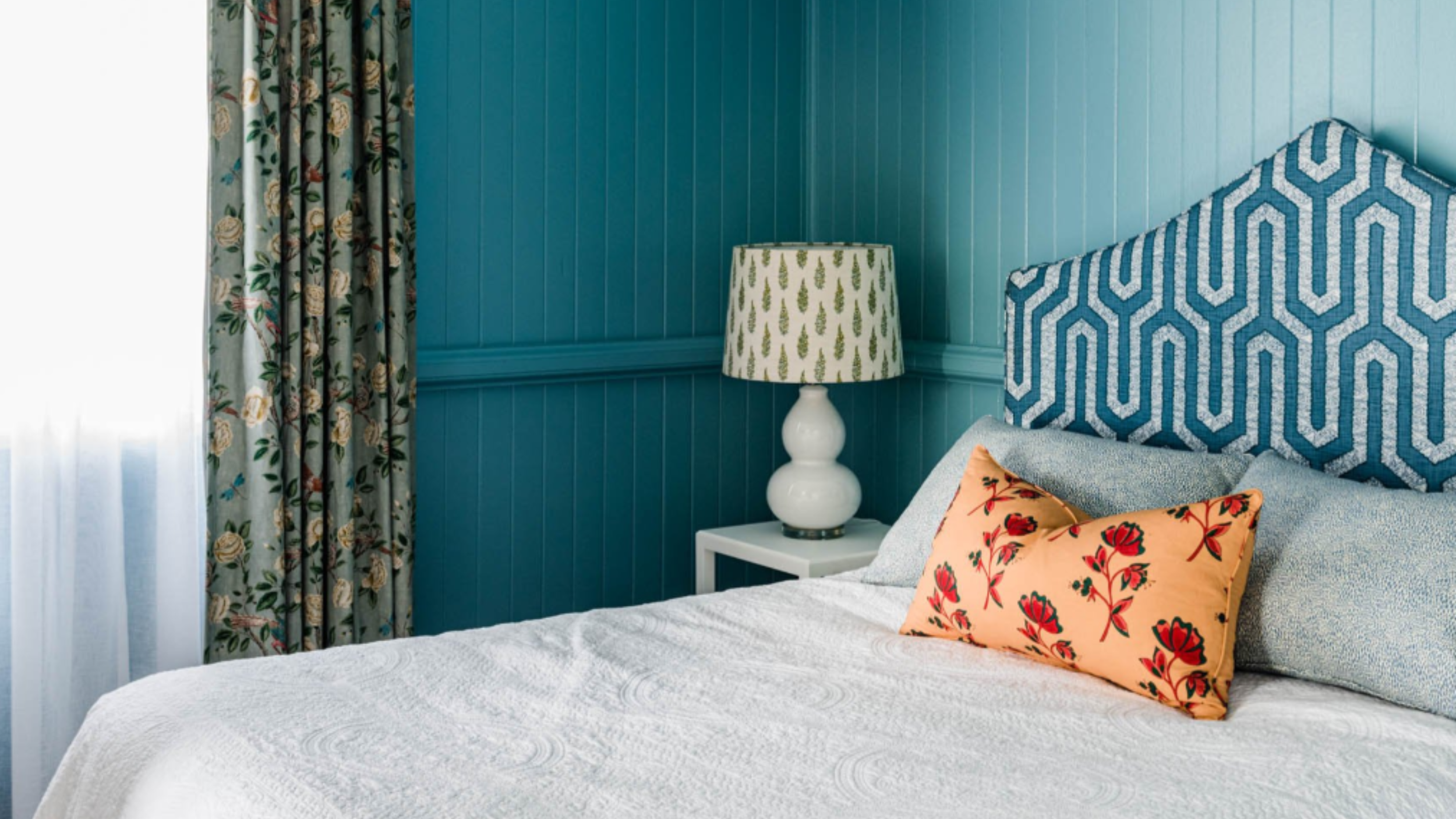
In the sunny paradise of Brisbane, we are truly blessed with an abundance of natural light, giving us endless options when it comes to selecting the perfect colour palette for our clients. Here in Queensland, we have a bit of an obsession with white, and it's no surprise that requests for white interiors flood our office. However, it's crucial to remember that the direction of natural light can greatly influence how colours are perceived in different rooms. With this in mind, we often make subtle adjustments to ensure maximum design impact.
When it comes to all-white interiors, there are a couple of go-to shades that never disappoint. Dulux Natural White and Lexicon Quarter have become trusted favourites. Dulux Natural White is perfect when a soft neutral base is desired, providing a soothing and elegant foundation for any space. On the other hand, Lexicon Quarter is our secret weapon for creating fresher, brighter interiors with a cool undertone, adding a touch of contemporary chicness to the mix.
And let's not overlook the transformative impact of wall-to-wall colour to bring your interiors to life. Rooms with lots of natural light look great with sunny yellows, crisp aquas and minty greens or rose pinks.
However, if you have a really dark interior room with minimal natural light instead of painting out a bright white consider wrapping the walls in a deep or pigment-rich tone and really play up the lack of natural light for a moody enveloping interior.
How to create Harmony with Colour Schemes:
When it comes to colour schemes, you can easily get lost in the sea of formulas available on the internet, each promising the perfect combination.
However, among the many options out there, one of our tried and tested favourites is the split complementary paint scheme. Not only is it visually pleasing, but it's also incredibly easy to implement.
Here's how it works: Begin by selecting your favourite shade from the colour wheel. This will be your main house colour, setting the tone for the entire space.
Next, direct your gaze across the colour wheel to find the hue directly opposite your main colour. This is the complementary colour, which will add a harmonious contrast to your house colour.
But wait, there's more! Take a peek at the colours on either side of the complementary colour. These are your split complementary colours, and they will serve as fabulous accent hues in your colour scheme. By incorporating these accent colours strategically, you'll be able to achieve a visually balanced and dynamic look.
While colour theory and formulas can certainly guide us in creating stunning palettes, what truly matters is finding what feels right for you and your home. As designers, we encourage our clients to dig deep and explore what draws them to particular rooms, exploring their inspiration boards and seeking out colours that resonate with them.
We even take a sneaky peek into our client’s wardrobes, as their personal fashion choices can offer vital clues about the tones they are naturally drawn to. This intimate understanding helps us curate the perfect colour palette, tailored specifically to each client's unique style and preferences.
Practical Tips for Choosing Colours:
Embarking on your colour journey is an exciting step towards creating a truly personalised space.
It all begins by delving deeper into those captivating inspirational images that have caught your eye. Take a moment to really think about why you were drawn to them in the first place. What elements of colour speak to you? Let these insights guide you as you navigate the world of hues and shades.
Grabbing colour charts and sample paints is a fantastic way to explore the vast palette available to you. Start thinking about colour schemes that match your own personal style and the vibe of your home. Let your imagination run wild and imagine all the possibilities and mix and match colours that go together perfectly to make your space feel just right.
As interior designers located in Brisbane, crafting well-considered, unique, and harmonious colour schemes is at the core of our work. We absolutely love designing spaces that truly represent our client’s styles and preferences. We take the time to understand their vision and consider the architectural elements of their home. Then, we work our magic by bringing together colours that perfectly blend with the space, making every nook and cranny come alive!
So, as you embark on your colour exploration trust your instincts and embrace the joy of discovering the perfect colour scheme that will transform your home into a haven of beauty and harmony.

Conclusion:
Overall colour plays a significant role in interior design, allowing us to shape the tone and atmosphere of a home. When designing a Brisbane home, it's important to consider the direction of natural light and make adjustments to maximise its impact. Wall-to-wall colour can bring interiors to life, while in spaces with minimal natural light, opting for deep or pigment-rich tones creates a moody and enveloping ambience.
The split complementary paint scheme is an effective approach to creating harmonious colour schemes, using the main house colour, complementary colour, and split complementary colours as accents.
Ultimately, the key is to explore inspiration, consider personal preferences, and craft a colour palette that reflects your unique style and enhances the beauty and harmony of your home.
If you’re wanting help choosing the right colour pallet for your Brisbane home get in contact with us here at Ivy + Piper now.